Have you ever stood in front of your wardrobe or paint swatches, paralyzed by the fear of clashing colors? You’re not alone. The difference between an effortlessly polished outfit and a chaotic one often comes down to understanding how colors work together.
Color theory might sound intimidating, but mastering it is surprisingly practical. Whether you’re getting dressed for work, redesigning your living room, or planning a special event, knowing which hues complement each other transforms you from someone who hopes things match into someone who knows they will.
This guide strips away the complicated jargon and gives you actionable color combinations you can use immediately, from your closet to your kitchen walls.
The Foundation: Understanding the Color Wheel
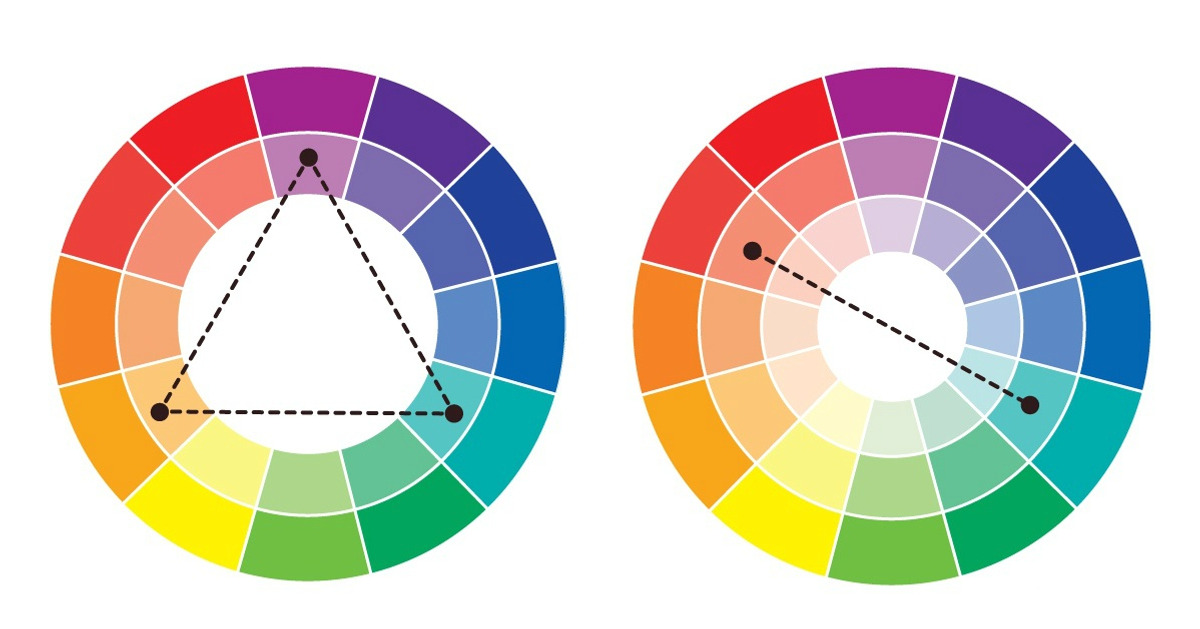
The color wheel is your secret weapon. It’s not just a tool for artists—it’s a practical map that shows you exactly which colors naturally harmonize. Think of it as having a trusted friend in every store and every design decision.
At its core, the wheel consists of primary colors (red, blue, yellow), secondary colors (orange, green, purple), and tertiary colors, which blend primary and secondary shades. Understanding these relationships removes the guesswork from your choices.
What makes the wheel truly valuable is that it reveals patterns. Colors sitting opposite each other create drama. Colors sitting next to each other create harmony. Once you recognize these patterns, you never have to worry about a bad combination again.
| Color Relationship | What It Creates | Best For |
|---|---|---|
| Complementary (opposite) | High contrast, vibrant | Statement pieces, accent walls |
| Analogous (adjacent) | Harmony, cohesion | Whole wardrobes, entire rooms |
| Triadic (equally spaced) | Balanced energy | Creative projects, bold designs |
| Monochromatic (one hue) | Sophisticated, calm | Minimalist spaces, professional looks |
Timeless Neutral Pairings That Work Everywhere
Neutrals are the foundation of any versatile wardrobe or home design. Black, white, gray, beige, and navy don’t fight for attention—they frame other colors while looking effortlessly elegant.
The magic of neutrals is their invisibility. You can wear black pants with virtually any color top and look intentional rather than accidental. They provide the canvas that lets accent colors shine without overwhelming the space or outfit.
Pairing multiple neutrals creates depth without loudness. Charcoal gray with cream, taupe with ivory, or navy with khaki all create visually interesting combinations that feel safe and sophisticated.
“Neutrals aren’t boring—they’re the foundation of every successful design. The mistake people make is using only one neutral. Layering different neutrals creates dimension that keeps spaces from feeling flat.” — Margaret Chen, Interior Design Analyst
Bold Combinations That Command Attention
Sometimes you want people to notice. Complementary color pairs—those sitting opposite on the color wheel—create immediate visual impact. Red and teal, yellow and purple, orange and blue all sing together.
These combinations work best when one color dominates and the other accents. A teal sofa with red throw pillows, or navy walls with mustard yellow trim, creates excitement without feeling chaotic. The key is proportion: don’t split your space or outfit 50-50 with bold colors.
Bold combinations excel in fashion for statement pieces and in design for accent walls or furniture. They’re less suited to being your entire home or wardrobe because they can feel exhausting in large doses.
| Color Pair | Mood | Works Best In | Proportion Rule |
|---|---|---|---|
| Navy & Gold | Luxury, formal | Evening wear, accent décor | 80% navy, 20% gold |
| Forest Green & Burgundy | Rich, sophisticated | Living rooms, autumn fashion | 60% green, 40% burgundy |
| Blush & Gray | Soft, modern | Bedrooms, contemporary fashion | 50% blush, 50% gray |
| Charcoal & Copper | Industrial, warm | Kitchens, modern lofts | 70% charcoal, 30% copper |
| Cream & Sage Green | Calm, natural | Bathrooms, bedrooms | 60% cream, 40% sage |
The Psychology Behind Seasonal Color Combinations
Nature provides the best color tutorials. Spring palettes feature soft pastels—blush, mint, pale yellow, and lavender. Summer explodes with saturated brights: coral, turquoise, lime. Autumn shifts toward earthy warmth: terracotta, olive, rust, and chocolate. Winter settles into cool metallics and jewel tones.
- ➡Top 10 Pedicure Trends That Will Take Over Spring-Summer 2026
- ➡10 Moments That Remind Us That Quiet Kindness Is the Silent Voice the World Understands Most
- ➡12 Workplace Stories That Prove Empathy Speaks Louder Than Job Titles
- ➡This Mom Is Going Viral for Sharing the Brutal Reality of Being a Working Mom
These aren’t arbitrary shifts. They reflect what colors actually surround us during each season, which is why seasonal combinations feel intrinsically right. Wearing navy and cream in summer can feel off somehow, while it feels perfect in winter.
The seasonal approach is especially useful for updating your wardrobe or redesigning spaces without complete overhauls. Swap your throw pillows and accessories seasonally, and your entire home feels refreshed without major investment.
“Seasonal color planning isn’t just about aesthetics—it’s about psychological alignment. When your clothing and environment reflect the actual season, you feel more connected and present. It’s a subtle but powerful effect.” — Dr. Jonathan Wells, Color Psychology Researcher
Creating Monochromatic Looks That Don’t Feel Boring
Using different shades of one color might sound limiting, but it’s actually one of the most sophisticated approaches to color. A charcoal suit with a lighter gray shirt and a darker gray tie feels cohesive and intentional, never monotonous.
The key is varying both the saturation and lightness of your chosen hue. Pair a bright emerald with soft sage and deep forest green. These are all “green,” but they create visual movement and interest through tonal variation.
Monochromatic spaces feel calm and curated. They work beautifully in minimalist homes, professional settings, and fashion because they emphasize texture, fit, and quality over color competition.
Mixing Patterns With Your Color Combinations
Patterns add another dimension, but they work best when colors align. The golden rule: keep your primary colors consistent. If your base colors are navy and cream, choose patterns that use these same colors, even if they add secondary hues.
Mixing different pattern scales prevents visual chaos. A large-scale floral with a small geometric print works. Two busy prints of similar scale compete for attention. The principle applies equally to fashion and interior design.
Neutral patterns—stripes, checks, and solids—work with virtually any color combination. They’re the bridge that lets you combine brighter hues without overwhelming a space or outfit.
“Pattern mixing is an advanced skill, but it follows simple rules. When in doubt, keep 70% of your pattern palette consistent with your color scheme and use the remaining 30% for personality.” — Sofia Rodriguez, Fashion and Design Consultant
Quick Reference: Combinations for Every Setting
Sometimes you just need answers fast. Whether you’re getting dressed or making a design decision, having proven combinations at hand eliminates decision fatigue.
For professional settings, navy with white and gray never fails. For casual confidence, black with white and any accent color works. For romantic or feminine spaces, blush with cream and soft gray creates effortless elegance.
- ➡10 Manicure and Pedicure Trends That Will Take Over Salons in 2026, According to Nail Techs
- ➡Brooke Hogan Reveals Why She Skipped Her Dad’s Funeral
- ➡10 Stories Where Life Fell Apart but Compassion Became the Only Light
- ➡Jason Momoa’s New Girlfriend Posts Birthday Tribute—Fans Notice the Same Awkward Detail
These combinations aren’t rules to follow rigidly—they’re starting points. Once you understand why they work (usually because they follow color wheel harmony), you can adapt them to your preferences.
The real mastery comes from recognizing patterns in combinations you admire. When you see an outfit or room you love, pause and identify the colors. You’ll start noticing patterns in what appeals to you personally, which is more valuable than any generic guide.
Common Color Combination Mistakes and How to Avoid Them
The most common mistake is using too many colors with equal visual weight. Your eye doesn’t know where to rest. The solution: choose one or two dominant colors and use others as accents.
Another frequent error is ignoring undertones. A cool blue looks jarring next to a warm orange, but a cool blue works beautifully with a cool coral. Paying attention to whether your colors lean warm or cool prevents subtle but noticeable disharmony.
Beginners often forget about lighting. Colors look different under natural daylight, fluorescent bulbs, and warm artificial light. Test your combinations in the actual space and lighting where they’ll live, whether that’s your bedroom or your body in your daily environments.
“The biggest mistake I see is people choosing colors in isolation. They fall in love with a paint swatch in the store, then come home and wonder why it looks wrong. Colors exist in relationship to other colors and to light. This relationship is everything.” — Thomas Morrison, Lighting and Color Specialist
FAQs
Which color combination is most universally flattering for skin tones?
Navy with warm neutrals (cream, taupe, gold) works across most skin tones because blue is naturally complementary to human skin. However, the secondary colors matter: cool undertones pair better with cool blues, while warm undertones shine with navy paired with warm golds.
Can I use three bold colors together?
Yes, but use the 60-30-10 rule: 60% primary color, 30% secondary color, 10% accent color. This prevents visual chaos while maintaining interest. Triadic color schemes (equally spaced on the wheel) also work naturally together in balanced proportions.
- ➡Top 9 Pedicure Trends That Will Take Over Spring and Summer 2026
- ➡12 Nightmare Neighbors That Made People Sleep With One Eye Open
- ➡Selena Gomez’s ‘Lizzie McGuire’ and ‘Suite Life’ Spinoffs Got Dumped: “I Was at My Wits’ End”
- ➡13 Moments That Remind Us Kindness Is Still Alive Even When the World Turns Away
How do I know if colors are too similar or too different?
Similar colors should contrast in lightness or saturation to avoid looking dull. Different colors should share an undertone (warm or cool) to maintain harmony. If colors feel “off” together, usually one of these principles is broken.
Should I follow seasonal color palettes strictly?
Seasonal palettes are guides, not rules. Use them as inspiration, but wear and use colors you love. If you adore a winter jewel tone in summer, make it work by pairing it with lighter colors and natural materials that feel seasonally appropriate.
What’s the safest color combination for home design?
Neutral base (70%) with one warm accent color (20%) and one cool accent color (10%) is foolproof. For example: cream walls, warm wood furniture, and cool blue accents. This creates depth without risk.
How do undertones affect color combinations?
Undertones are subtle color hints beneath the main color. Red has warm or cool undertones, blue has warm or cool undertones. Matching undertones—cool with cool, warm with warm—creates visual harmony. Mismatched undertones create subtle tension.
Can I wear bold color combinations in professional settings?
Absolutely, if done thoughtfully. Keep the combination to one statement piece (blazer, dress) with neutral basics. A burgundy blazer with black pants and white shirt reads professional and confident, not chaotic.
What if I choose colors I love but they don’t “match”?
Use neutrals as a bridge. Add cream, gray, or white between colors that feel uncomfortable together. This allows you to incorporate colors you love while managing their relationship.
Should my entire home use the same color palette?
Your home benefits from a consistent palette to feel cohesive, but you can vary saturation and undertones in different rooms. A cool gray bedroom and a warm gray living room still feel connected if they’re the same base neutral.
How do I test color combinations before committing?
For fashion, wear items together at home first. For home design, buy paint samples and hang them for several days in actual lighting. For furniture, photograph colors together and check the photo on different devices. This accounts for how colors truly look, not just in isolation.
What’s the difference between complementary and supplementary colors?
Complementary colors sit opposite on the color wheel and create high contrast (red and green). Analogous colors sit beside each other and create harmony (red and orange). Most people confuse these terms, but knowing the difference helps you choose whether you want drama or calm.
Is black always a neutral?
Yes, but it’s a “cool” neutral with strong visual weight. It recedes and creates drama differently than softer neutrals like gray or taupe. Use black strategically when you want sophistication or grounding, not always as a default.